
Mentee to Mentor’ is a series of articles featuring budding digital marketers who’ve learnt the practical aspects of digital marketing under my mentorship. As part of their internship experience, they came across exciting challenges that they had to solve. And they learnt some valuable lessons that they’re sharing with you here.
Second up in the series is Lorenza Picco who excels at creating beautiful designs that are consistent with a company’s brand and values.
Here she is, with her findings.
The main goal of digital marketing is to increase the awareness of our brand and to grab the right people’s attention to our product or service. But have you ever wondered what is the secret to an effective marketing campaign?
Well, it’s easier than you think. You just need two essential elements:
– Good copywriting
– A captivating graphic design
A snappy heading and good copywriting can really make the difference when it comes to launching your business online. While the design of your logo, your website and your social media profiles is what makes you stand out from the competition. Plus, it gives an identity to your brand and lets people recognise you. That’s why it’s so important to make sure to always convey your big message through an eye-catching yet simple graphic. But what does it take to create a beautiful design?
Here is a list of five tips that I came up with combining together my experience as a digital marketing intern and some research on graphic design.
- Be smart
You don’t need to be creative to make a beautiful design, just smart.
When starting a new creation, the first thing to do is to choose a theme, a topic. Just pick something you’d like to work on and think of a design that could work together with it.
Once you made up your mind, you have two options: to create from scratch or to use a template. Both have their pros and cons. For example, creating from scratch is an original solution, but it can be really stressful and it takes a lot of time. While using a template is a convenient solution but it’s less original.
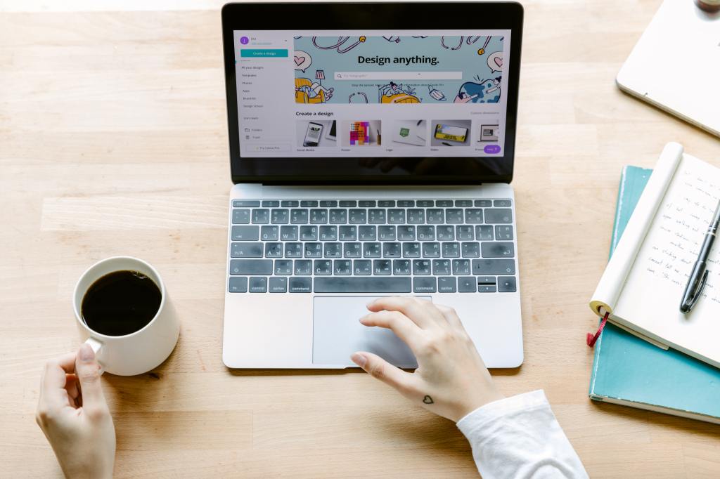
Or you can opt for a fair compromise: try to get inspiration from templates, save what grabs your attention and then combine them together to create something new. You’ll be amazed at what you can come up with.
- K.I.S.S.
K.I.S.S. is the acronym of Keep It Short and Simple.
Too many details, different styles or different text fonts can become really overwhelming. Instead, try to choose three essential elements, like an image, a background and a text. You’ll get a simple and clear design.
Then, keep always in mind the Golden Rule:
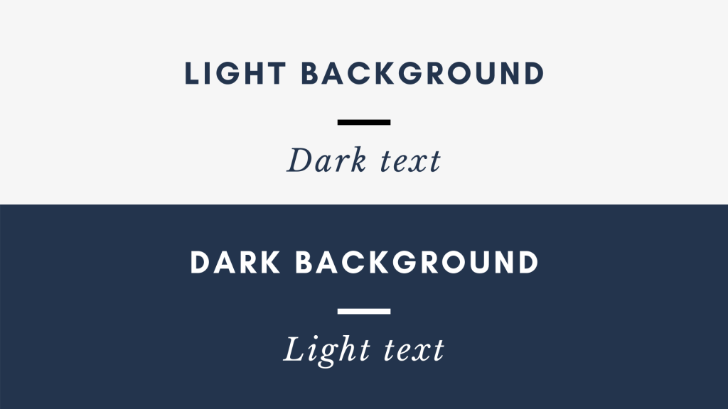
And if you don’t want to make your design look like a Carnival party you should use one font for your entire work. But be sure to play with the weight of words. What does it mean?
Every text font comes with different versions, like bold, semi-bold, regular, light or even ultra-light. You got the idea. If you have a title, you want it to stand out from your work, don’t you? You should then use a bold version of the text font. While if you have a subtitle, you could use a semibold or light version. The regular version is the best solution for body text.
- Balance your work
The structure of your work needs to be balanced. If the elements within the page are displayed in a clear and well-organised way, then your design becomes automatically beautiful. But, how to make it balanced?
Symmetry is key. When trying to balance your work, pay attention to symmetry, space and how you distribute the weight of the elements within your design. Harmony between the different parts is needed.
If your design is symmetrical, then it’s balanced, because it’s equal on both sides. While, if it’s asymmetrical, it can be balanced, if the weight of your elements is well distributed. But how do you do it?
Using the Rule of Thirds. Imagine your work divided into a 3 by 3 grid. If your elements are placed near or on the lines of this grid, then it means the design is balanced, because it grabs the attention to the right things. What is the psychology behind this? Actually, according to studies, the human eye naturally follows this path when observing a design.

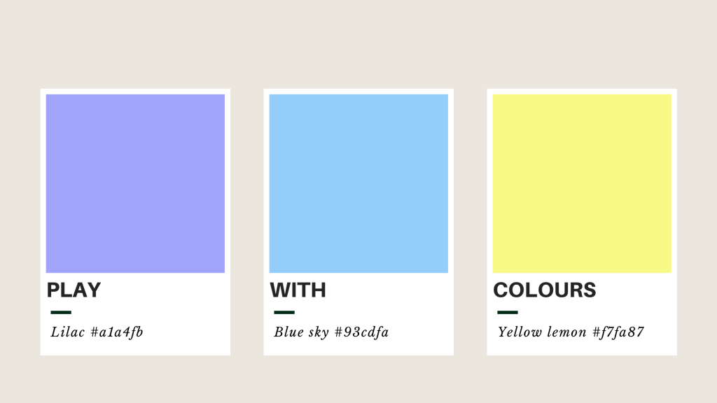
- Play with colours
But be careful!
Colours are essential. They make your design eye-catching and visually beautiful. On the contrary, if you put too many colours together, your design becomes overwhelming and confusing. That’s why it is so important to learn how to use them.
If you see a colour that you like and you’d like to use it, download a colour picker such as ColorSlurp. It’s an app that can help you find colour codes. A colour code is simply a code made of numbers and letters, that identifies each colour.
But, not all the colours work well together. That’s why it is always important to create colour palettes. A colour palette is a combination of colours that go along with each other and that you can use all over your work. For example, Adobe Colour is an online portal that allows you to create different palettes.
The same rule applies to images. If you struggle in finding an image to enrich your design, just pick one that has similar colours to the palette that you are already using.
- Experiment
Finally, there’s no best solution than to experiment by yourself. Now that you have learnt what are the essentials of graphic design, pick a blank page and start creating what you have in mind. Observe what’s around you, get inspired and trust your hunch. I’m sure you’ll get a wonderful design.
Here are the links to some of the best free graphic designs portals:
visme.com – canva.com – crello.com
About the author:

Lorenza is an Italian student in Languages and Communication for Business and Tourism. She just became a digital marketing intern at ProLingua Global, learning about the practical aspects of online marketing under my mentorship. I asked her to describe herself in just one sentence:
‘Language enthusiast with a creative mind and a gentle soul.’
She has a passion for graphic design and she would love it to become part of her future experience. When she’s not spending her time reading, she likes cooking and trying out new recipes.
Reach out to her via LinkedIn: https://www.linkedin.com/in/lorenzapicco/
